Starting with a bang in 2021
The Nothing story started with a pair of TWS– the Ear (1). Although most people expected that Nothing would start with a bang and get into smartphones straightaway (given Pei’s track record), Nothing delivered a curved ball and launched a pair of TWS. Pei had claimed that this pair of TWS was going to bring excitement back into the true wireless earbuds zone. So it did. When Nothing released the Ear (1) in the market, TWS came in different shapes and sizes, but we seldom spotted a pair of TWS that were exceptionally distinct, apart from the AirPods. With the Ear (1), Nothing changed that. The brand brought along a design that was thoroughly unique in the sea of faceless, nameless TWS. So unique that we have not seen any attempts by the competition to copy it. The Ear (1) came with a predominantly transparent theme. The case of the TWS is usually a boring old box. This one was transparent, which allowed the user to see the buds resting inside without having to open the case. A combination of black and white, the buds made a design statement on their own too. The semi-transparent stem that extended from the white bud heads was very distinct from anything the tech world had seen before. And if all of this wasn’t enough to identify the Ear (1) as Ear (1), the Nothing Ear (1) badging in the very retro, pixelated font on the stem of the buds did the trick. With the Ear (1), those who were looking for a stand-out pair of TWS with good performance and not too high a price tag found their option.
Phone-ing in something different in 2022, and (ear) Sticking out too
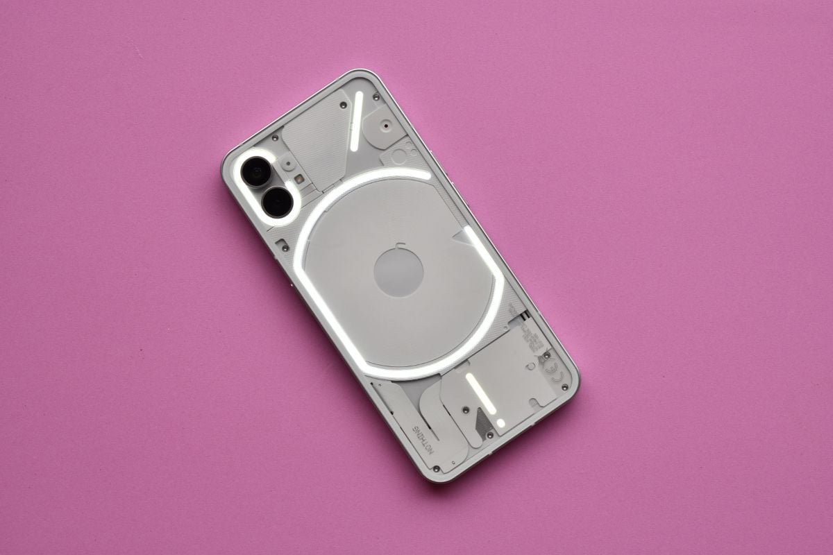
That was it for the year 2021. Then came the year 2022, which saw the brand launch its first phone, the Nothing Phone (1) and another pair of TWS, the Ear (Stick). Much like its first product, the Ear (1), the two that came next also hit the design ball out of the park. The overall theme, even with the new products, remained transparent and was religiously followed. The Nothing Phone (1) was laden with hundreds of tiny LEDs on the back, which were encased in a transparent back and lit up to highlight notifications and charging status. Nothing called this the Glyph UI. The transparent back also gave a sneak peek of the innards of the phone. The Ear (Stick), which followed later in the year, was our personal favorite of the three Nothing products. This had little to do with the design of the buds but more to do with the design of the case that housed them. As the name suggests, Nothing took inspiration from the very ordinary make-up product, the lipstick, and designed a cylindrical case that was to be twisted open to get to the buds, like lipstick. Both the products were the design highlights of the year 2022, and we said as much and poured praises over Nothing for not only pushing the design envelope but tearing it up completely and showing the world that tech does not have to be boring.
Ear(2) in 2023: You too, Nothing?
Then came the year 2023, and our hopes from Nothing were soaring. And why wouldn’t they? Nothing had made a very strong design statement with its other products, and with the new year, we were hoping even more out-of-the-box tech design would come from the brand. Unfortunately, our design dreams were left unrealized with Nothing’s first product of the year, the Nothing Ear (2). The design fireworks we usually get with a Nothing product turned out to be duds. For the Ear (2), Nothing decided to give us the same design as the Ear (1). THE EXACT SAME design. The only visible difference was the Nothing Ear (2) badging on the stems of the buds, and the case of the Ear (2) seems a little smaller, but other than that, it is basically the same design. This would have been more than acceptable from any other brand in the market. After all, the last year has mostly seen design clones come out of most brands’ closets. Brands like Apple, Samsung, and OnePlus, all launched smartphones and TWS that looked very much like some of their previously launched versions. People were disappointed, but it was not something unexpected. This wasn’t the case with Nothing. Nothing made all sorts of declarations about how the brand was different from the usual tech players who reused the same old designs for their devices. And it walked its talk with its first three products. But it actually broke our design hearts when Nothing used the same design it had used with the Ear (1) for Ear (2). After all the claims of making tech exciting and taking the boring away from tech, this seemed like a rather uninspiring move, especially after the brand had given us such design wonders over the past two years. With the Ear (2), while Nothing pushed the price bracket, the design, which has been one of the biggest USPs of Nothing devices, remained unchanged. The insides and tech might have changed, but this is not different or exciting. This is business as usual, just like many others who insist that the old bodies of their products come with new tech souls. Does this mean Nothing is one transparent trick pony that has done all it could to attract attention? With rumors of the Phone (2) around the corner, we sincerely hope not. We hope the brand does not end up using the same old Phone (1) design with minor tweaks because if it did, it would mean the excitement that Nothing had brought back to the tech world was merely temporary. We hope we are proved wrong because tech does need something like the Nothing of 2021 and 2022.


![]()
